Brand Identity:
GovNet
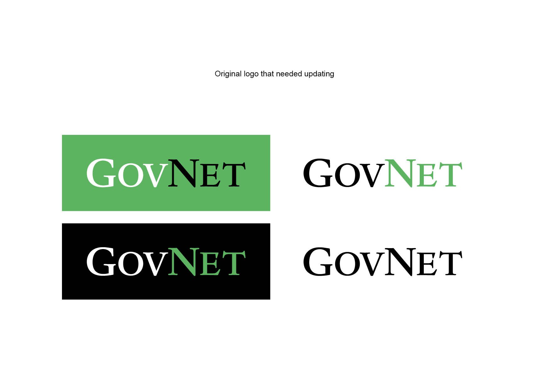
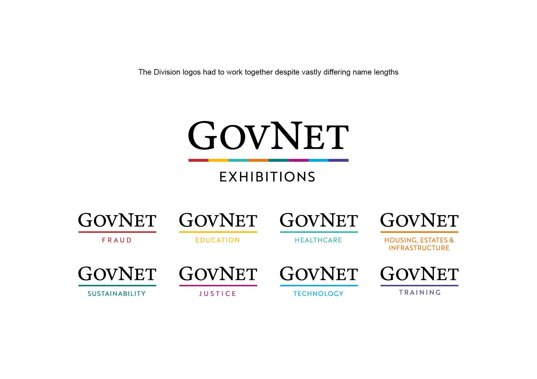
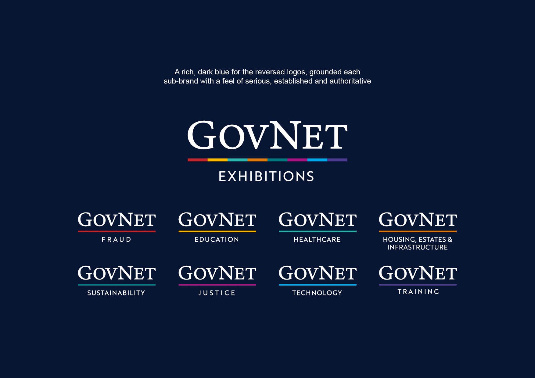
My requirement was to modernise the existing logo that had been active for over a decade, whilst not discarding the familiar heritage of the overall look. The logo would need to work across an umbrella brand with six distinct pillars forming a family of brands.
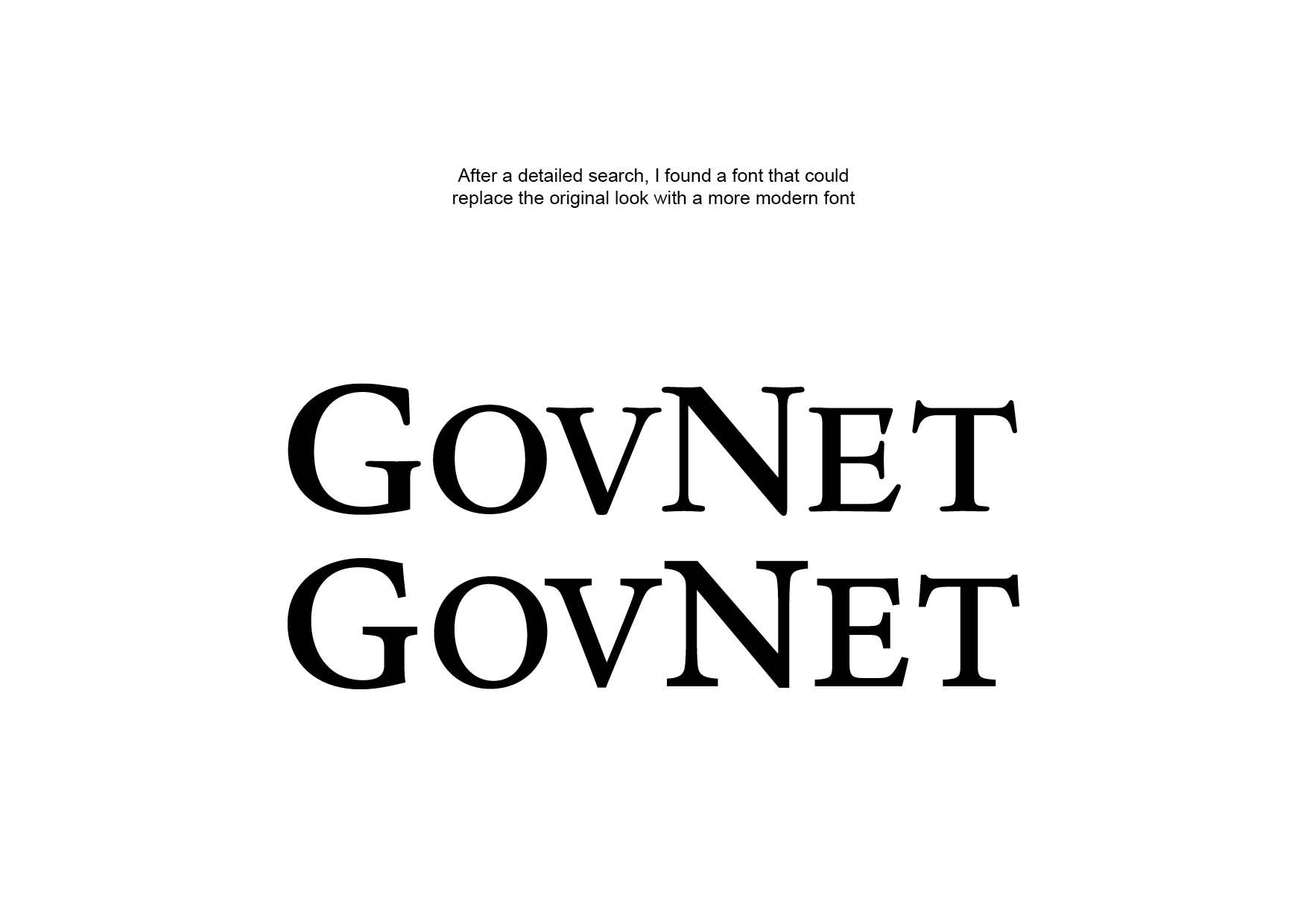
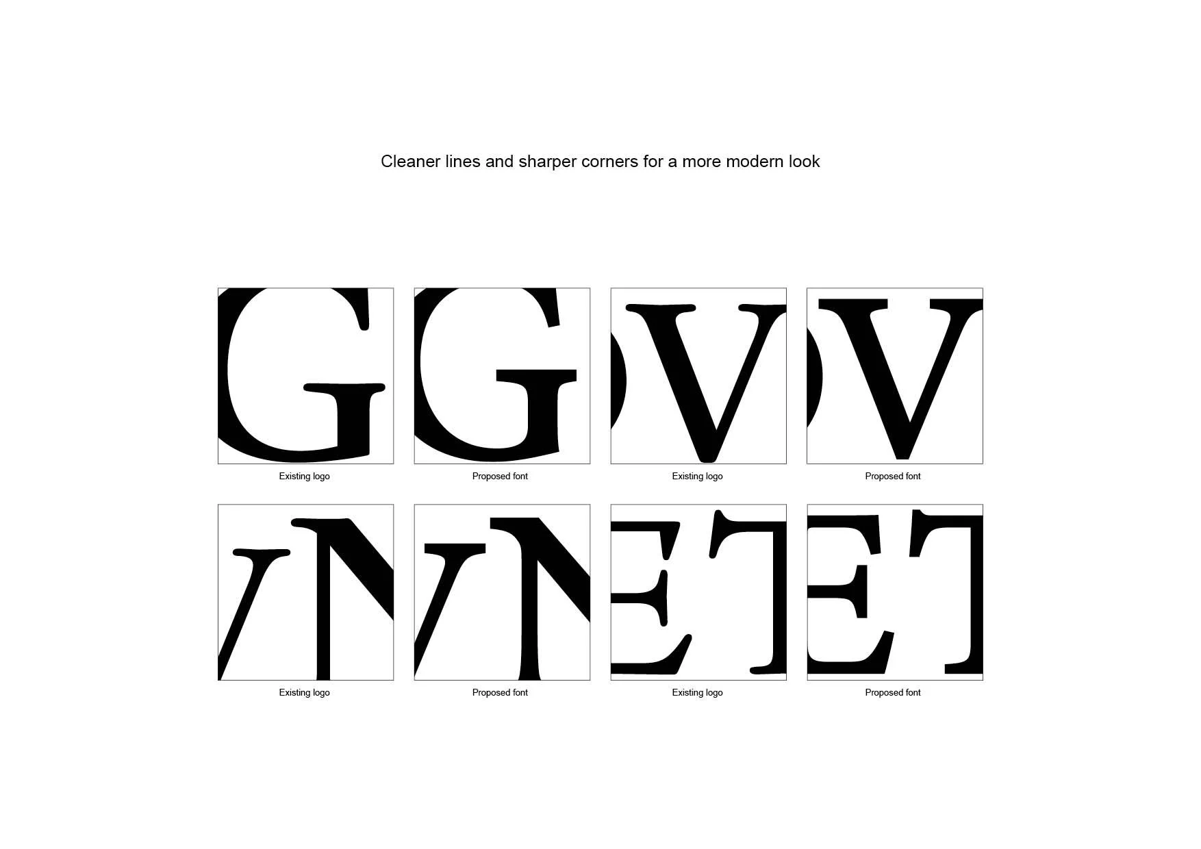
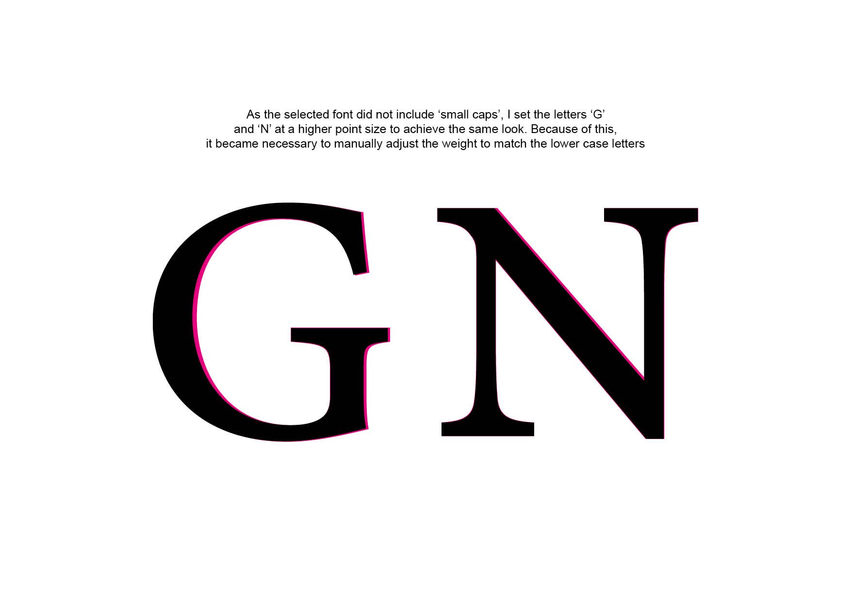
Having found a font that would give an overall similar feel to the original logotype but with modern, crisp lines and serifs, I then proceeded to carefully adjust the overall weight of the font and modify some of the letters to give a cleaner, sleeker look.
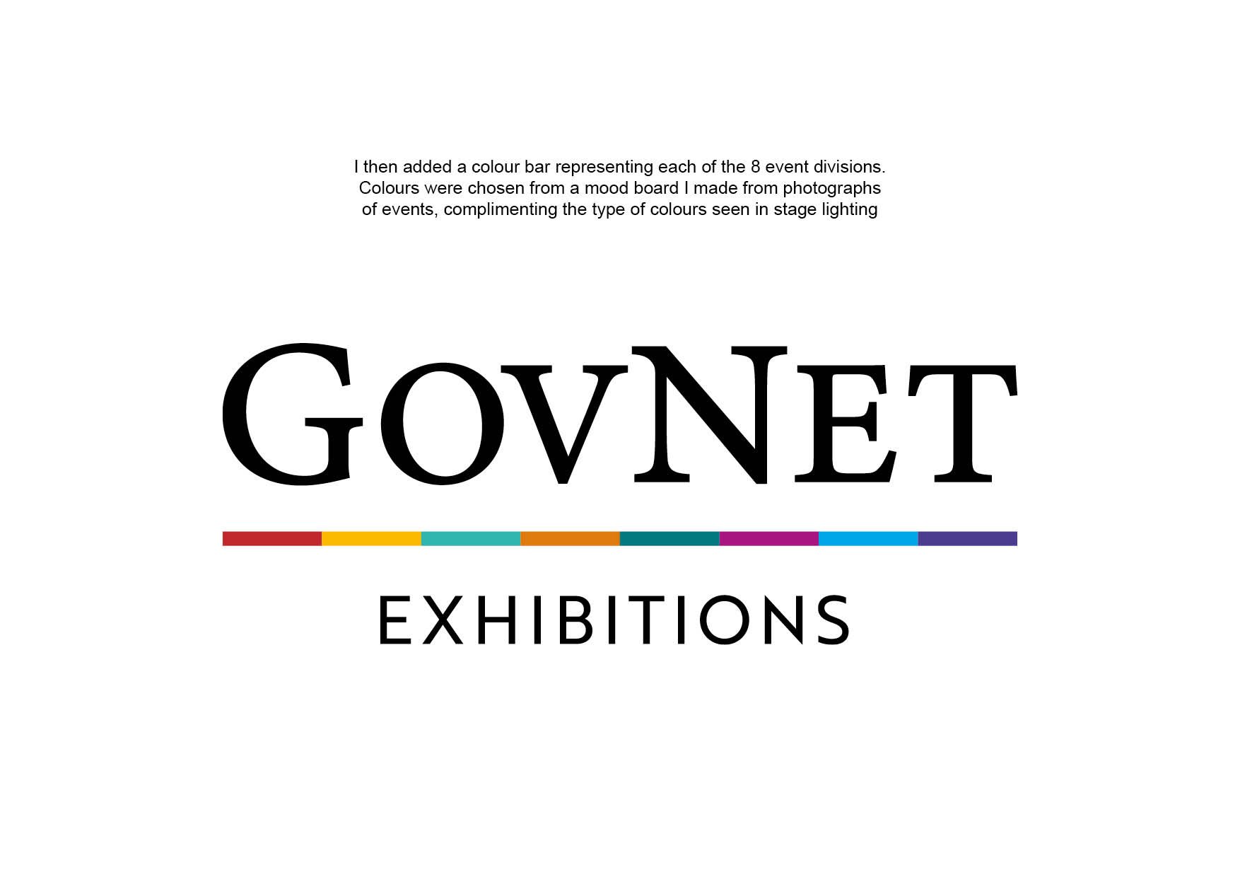
I added a bar of colours to represent the various pillars, which also served to reflect an excitement and vitality of colour seen in the fast paced nature of events GovNet specialise in. Further, the colours show a diverse range of people, attracting new employees, exhibitors, sponsors, speakers and visitors alike.
It was important not to overthink and to keep the identity simple and legible at a distance. The logo had to be versatile, enduring and emanate class, professionalism, and vitality, whilst reflecting a multi-faceted business with an energetic and diverse culture. This was as much an exercise in taste and restraint as it was a design project.